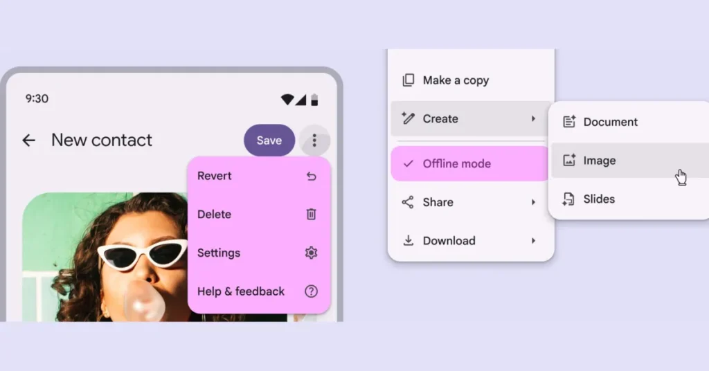
Following the initial wave of Material 3 Expressive, Google is working to redesign the remaining components to the latest design language, and menus are up this month.
M3 Expressive introduces “vertical menus” that have “new shapes, color styles, selection states, and refined submenu motion.”
Compared to the previous “baseline menu” (which is still available to use), corners have been rounded, while dividers and the current selection no longer span the full width of the container.
Baseline vs. vertical menus
Google introduced a new “with gap” option to join “with divider” for a “more flexible layout on Android” and distinct separation. They can be used to “bundle similar actions together,” and “are more expressive than dividers and make the relationship between items clear.” Usage guidelines include:
- Avoid changing the size of the gap
- Limit the number of gaps in a menu to one or two
- Don’t use gaps in scrollable menus
On the color style front, a “vibrant” menu stands out a great deal more than “standard,” though Google recommends they “should be used sparingly.”
- Standard: Surface-based, lower visual emphasis
- Vibrant: Tertiary-based, higher visual emphasis
Menus work nicely with the new split button, while ME3’s shape morphing can be used to have the “corners of the focused submenu become more rounded, while the unfocused submenu becomes less rounded.” As seen below, this “adds a dynamic quality to menu interactions.”
Back at I/O 2025, Google introduced five new expressive components: button groups, FAB menu, loading indicator, split button, and toolbars. A slew of existing components were also updated: buttons, extended FAB, FAB, icon buttons, progress indicators, navigation bar, navigation rail, app bars, menus, sliders, and toolbars.
FTC: We use income earning auto affiliate links. More.


